ORBIT.
Making the surgical care journey more visible. A proposed QR-enabled patient flow system connecting patients, clinical staff, families and hospital administrators across the operating theatre journey.
The question behind Orbit
What if everyone involved in a patient's journey could see where that patient was, what had happened and what needed to happen next?
Hospitals are complex systems. Patients move through multiple stages, healthcare professionals manage different responsibilities, and information needs to reach the right people at the right time.
Orbit explores a centralised digital patient flow management system for ophthalmology operating theatre workflows. The project began by looking at the coordination problem behind the interface, not just what a dashboard should display, but what different people need to know to keep a patient journey moving.
Understanding the people in the system
One patient journey, four different perspectives.
The same patient moves through the same process, but the questions each person needs answered are different. I used these role needs to shape the information structure and the interface direction.
Need relevant patient-status information to coordinate care and understand readiness.
Need to monitor movement, update stages and make handoffs visible.
Need an overall view of patient progression and operational status.
Need relevant status and completion information for administrative processes.
Design takeaway: A single interface cannot answer every role's questions equally well. Orbit explores a shared patient record with role-specific views.
Five stages. One connected journey.
Orbit structures the patient journey around five stages, giving the team a shared language for progression.
Patient is registered and awaiting the next stage.
Patient progresses into the daycare stage.
Patient moves to the block room before OT.
Patient reaches the operating theatre.
The tracked patient journey is marked complete.
The intention is to make patient progression easier to understand without relying entirely on repeated manual status enquiries. Stage and time tracking are explored as part of this shared view.
Turning workflow into interface
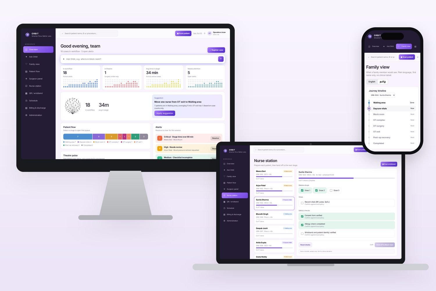
The interface exploration brings patient tracking and operational visibility into a centralised web-based dashboard.
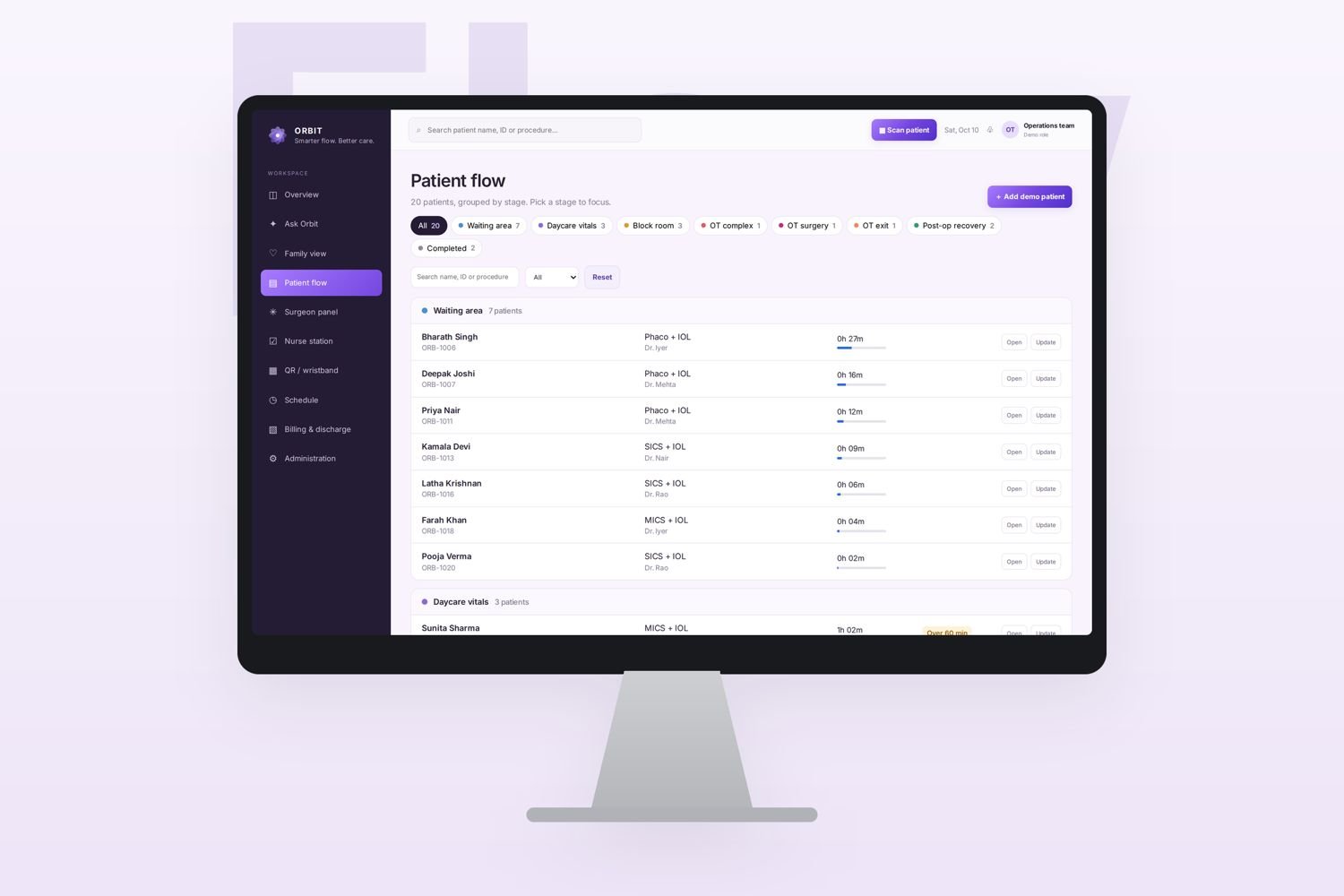
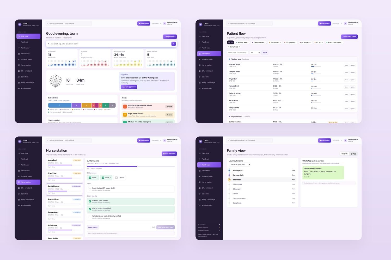
Operations dashboard
The dashboard is designed to make the overall patient journey scannable. It brings patient records, stage information and operational status into one place, so administrators can understand what is moving and what may need attention.
Design focus: overview, hierarchy, status visibility and information density.
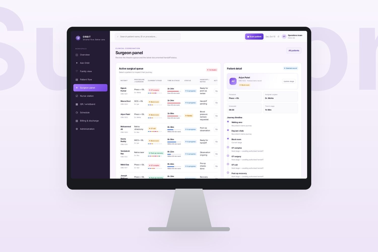
Surgeon panel
The surgeon-facing view narrows the information to what is relevant to the clinical role. It explores a queue-based layout with patient readiness and status information presented in a more focused way.
Design focus: role relevance, quick scanning and reduced information noise.
Nurse station
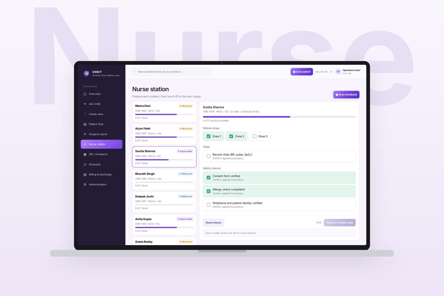
The nurse experience explores how preparation and stage updates can be made visible in the workflow. The aim is to support clear handoffs and reduce reliance on memory or repeated verbal updates.
Design focus: task sequence, completion states and handoff clarity.
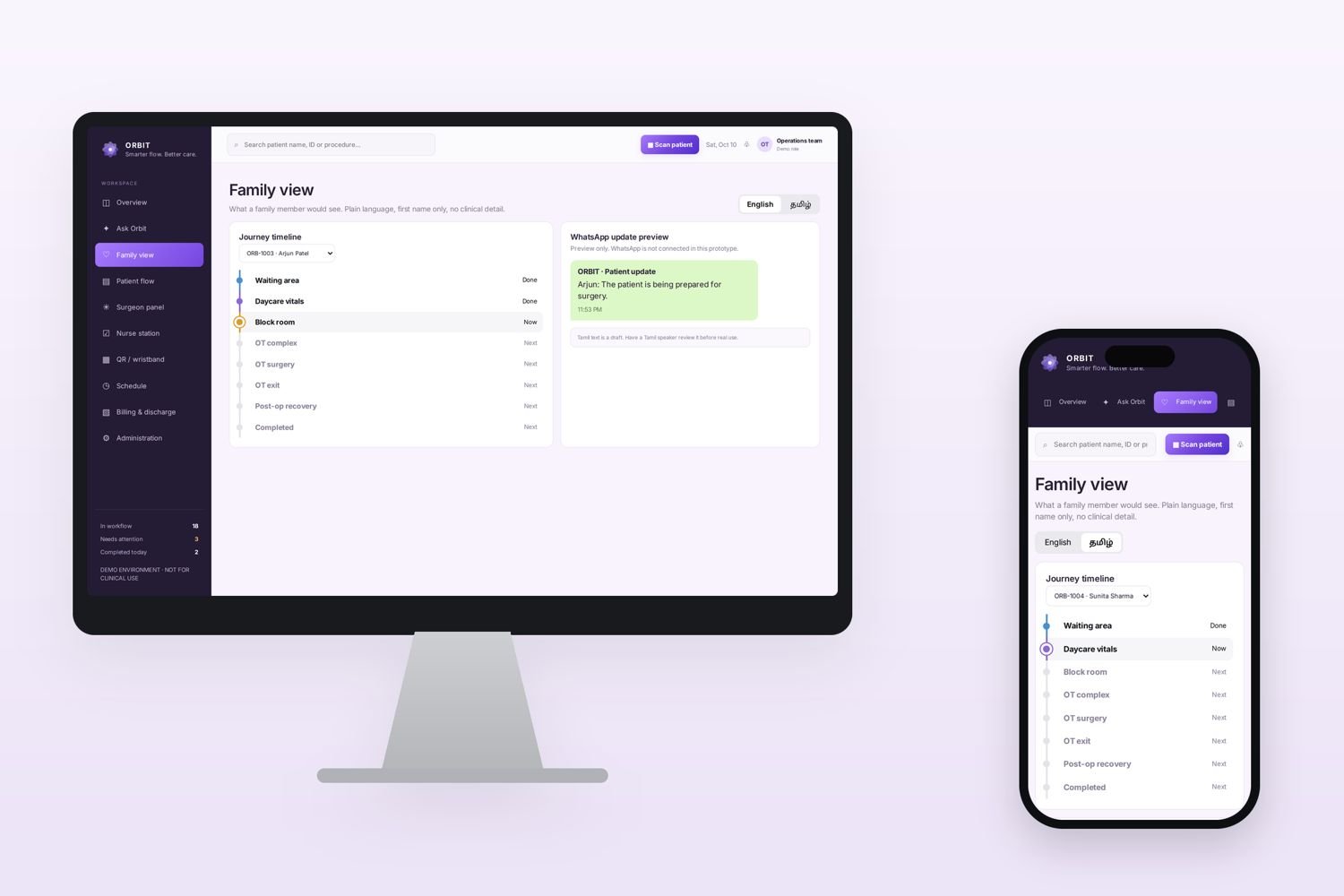
Family timeline
Families need progress information in language that is easy to understand. This view explores a simplified timeline that communicates where the patient is in the journey without exposing unnecessary operational detail.
Design focus: reassurance, plain language and appropriate information access.
QR-enabled tracking
QR codes are explored as a way to support patient identification and stage-based tracking.
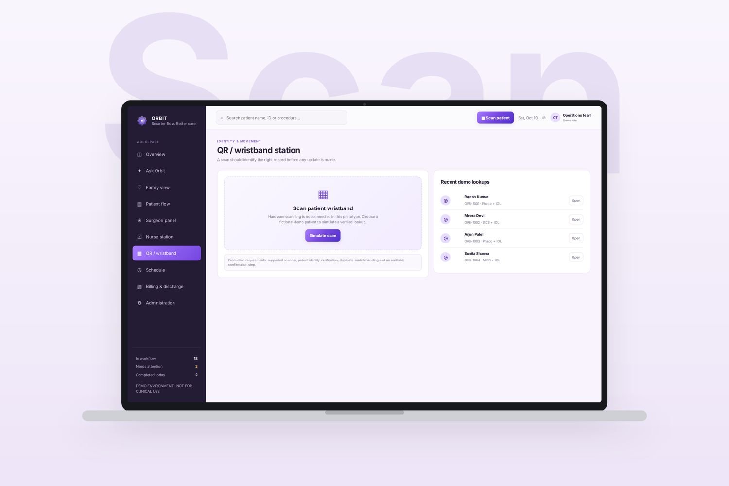
Make the handoff visible
The QR workflow is intended to connect a patient record with the stage update, so the movement through the journey can be recorded and viewed by the relevant roles.
The concept also considers the time associated with stage progression, creating a clearer operational picture.
This is a proposed flow shown in the prototype. It is not a claim of a live QR scanner or connected hospital system.
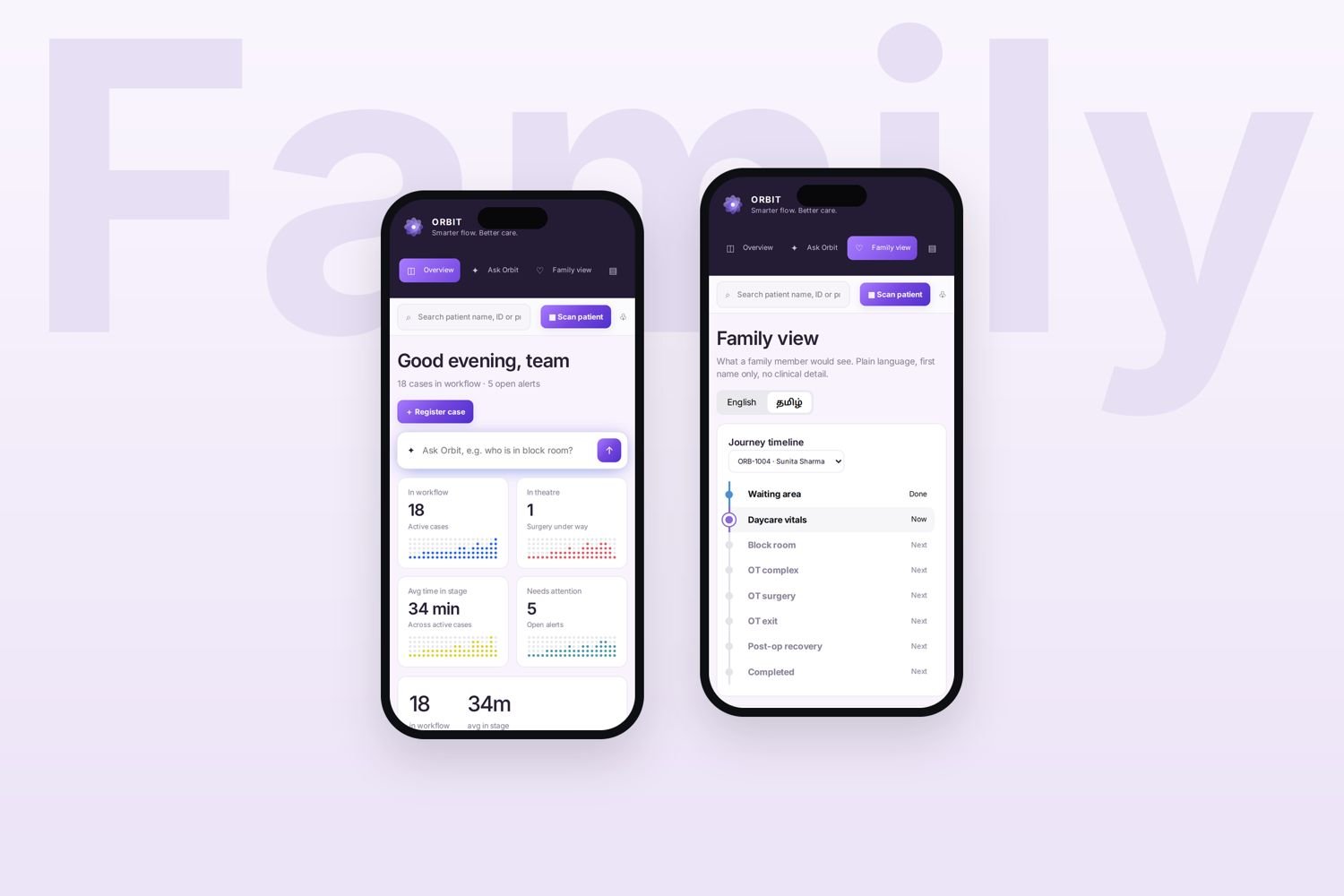
The wider interface system
The interface work includes a desktop dashboard, role based screens and a family mobile timeline. The layouts share a visual language while adapting the level of detail to each user group.
Visual identity: Orbit evolved from an earlier identity called Aurosync. The final direction uses a purple and lavender palette, a distinctive four-petal interlocking mark and the line “Smarter Flow. Better Care.”
Process & design direction
The work focused on understanding the patient journey and translating its coordination needs into a clear digital product direction.
Understand the patient journey and the coordination problem behind it.
Identify stakeholders, role responsibilities and the five journey stages.
Explore information architecture, role based user flows and dashboard hierarchy.
Develop interface direction, QR-tracking concept and visual identity.
- Problem framing and workflow exploration.
- Stakeholder and role identification.
- Five-stage patient journey mapping.
- Information architecture and role based user flows.
- Dashboard, interface and visual identity development.
- Digital prototyping and development exploration.
Technology & prototype status
Orbit was explored as a web application using Node.js, Express.js, MongoDB and JSON Web Tokens (JWT). The proposed architecture supports patient information management, authentication, role based access and patient-stage tracking.
Prototype status: High-fidelity interface directions are visualised. The source presentation notes that a live EMR connection, QR scanner, messaging and patient-data integration were not demonstrated. The work is presented as a prototype exploration, not a deployed hospital system.